
New Project Launch: Silva / Salinas

Close your eyes and think of a law practice.
Think of their logo, their letterhead, the website. What do you see? Does it involve clip art gavels or scales of justice? Partner’s names set in some boring copperplate type? How about stock imagery of judges, ionian columns, or thick, dusty law books on oak shelves? Maybe you see a billboard screaming “INJURED?” with a photo of some sleazy looking lawyer? Or maybe it’s some totally over-the-top rococo performance art like this. With the possible exception of that video, this is all pretty standard stuff for a law practice.
Boston area attorney Marc Salinas saw all that too.
Early this year, Marc partnered with attorney Donna Lagana Silva to form new practice: Silva / Salinas, LLC. Thinking about the identity and perception of the new practice, Marc knew he didn’t want any of that same old approach. He wanted a fresh perspective. He approached me, an outsider to the law business, to develop an identity and build an online presence for their new practice.
As is true for most attorneys, Marc explained to me that almost all his clients come to him via word-of-mouth referrals. That meant the top priority in developing an identity and online presence for Silva / Salinas was to make a good first impression. Potential clients who have been referred to them should be able to look them up and quickly get a sense, that yes, Silva / Salinas is a law practice they would feel good about working with.
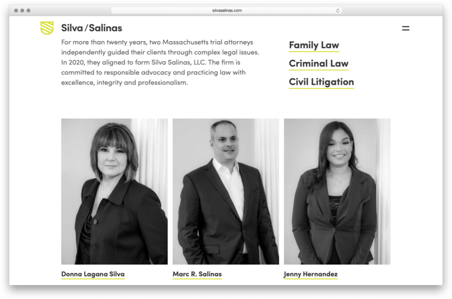
To develop the visual language for Silva / Salinas, I turned to my frequent design partner, John Magnifico. Excited by the challenge of creating an identity for a new firm in this typically staid profession, John keyed in on the alliteration in the Silva / Salinas name to create a shield logo from a stylized double S. Paired with a crisp typeface and a fresh, modern, and approachable color palette, the Silva / Salinas identity came to life.
Using the branding cues as a springboard, I then fleshed out a site design and build. Once again, it had to make a good first impression for potential clients. Not only did it need to look inviting, but it also had to give them the confidence that Silva / Salinas would be smart, savvy advocates for their legal needs. On the site, not only do you get to know the Silva / Salinas team, but you can read stories of their past results to get a good sense of how they’d work for you.
Marc wanted to be able to keep the site content fresh and up to date himself, so I selected WordPress as its content management system for its familiarity to both content managers and developers. As is my preferred approach to WordPress templating, I once again utilized Timber and Advanced Custom Fields. It’s a powerful combination. Together, they allow the flexibility to structure the site code and content any way you want, while keeping both the content management and the under-the-hood code simple and approachable.
As a lawyer, Marc is knowledgeable about ADA compliance issues. He wanted to make sure that the site was fully accessible beyond its obvious visual cues. True to my approach to building sites, I was thoughtful about the markup that dictates the page structure. I ensured that users could navigate well with a keyboard. I checked color contrasts for sufficient legibility. I navigated the site with a screen reader. And of course, I ran automated checks for ADA compliance. Silva / Salinas has no need to worry about anyone targeting their site as inaccessible.
Take a few minutes to peruse the Silva / Salinas site. I’m pretty proud of it, and I hope you’ll agree that it’s a fresh take on what a law firm’s identity can be.